|
|
| home | features | exhibitions | interviews | profiles | webprojects | archive |
|
Sandra Blow Ian Massey
Sandra Blow aimed in her painting for what she described as “an unexpected quality… an element of surprise… the thrill of a leap, a daring, a lightness.” [i] This quality is manifest in an exhilarating sense of possibility in her work, the perception that each painting exists somehow on the cusp of completion, its past, present and potential future balanced in suspended animation. Hence, each work offers its own fulfillment and resolution whilst seeming also to act as a provisional statement which might yet be subject to revision. One sees this in many of the large canvases made during the last twenty years of the artist’s life. Integral to their quality, and fundamental to Blow’s aesthetic, is her particular use of materials and their deployment. Collage is central to the artist’s processes, and her technique is to some degree sculptural, in that her canvases combine both painted and constructed elements. It is an approach rooted both in 'art informel' and in the truth-to-materials ethos of modernism, and in Blow it encompasses an enlivening disregard for the niceties of facture. Traces of development remain conspicuous in the surfaces of the paintings, their means of production insistently visible, vital in fact to the life of the work. Blow’s palette derives from both untreated materials – raw canvas, hessian, scrim – and from a highly selective use of painted colour, applied both en bloc and as distinct accents.
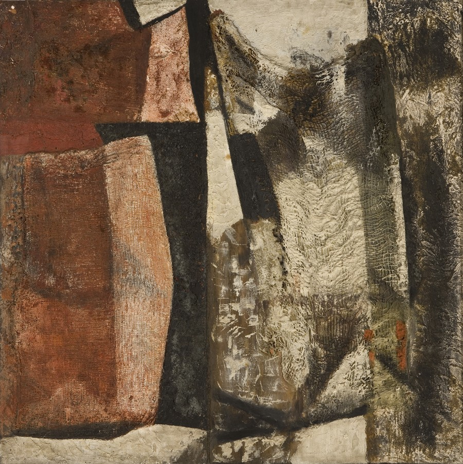
Amongst artists key to the development of Blow’s work were her friend Roger Hilton, his influence apparent in a certain insouciance of application, and in charcoal lines applied direct to canvas. There is also Matisse, a presiding spirit evident in a spatial lightness and the use of papier collé. Before these artists came the work of Alberto Burri, with whom Blow travelled in Italy in 1947-8, ‘a great education’ that confirmed and consol-idated her interests at a crucial time in her development. From Burri she took the idea of incorporating non-art materials, such as sacking, pumice, and grit. Notwithstanding the raw sensuousness of such materials, Burri was at heart a formalist, his art deeply informed by Massacio and Piero della Francesca, and equally integral to Blow’s education was the Renaissance art she looked at with him during their travels together. Burri’s influence is clearly apparent in Cornwall (1958 - above), the one comparatively early painting shown here. All of Blow’s painting begins with the imposition of a rigorous compositional structure, from which the canvas then becomes an arena in which to choreograph each element. Predetermination and serendipity each play a part within a flexible experimental process.
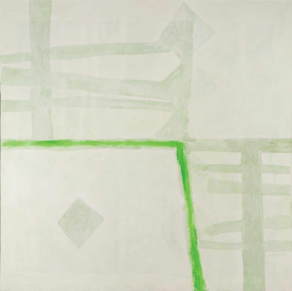
A predominant concern in Blow’s painting is one of light; not Impressionist light, in which each brushmark represents a digit of colour-as-light, but rather in its broader spatial interplay. It strikes one particularly in those canvases in which the mood is tranquil. Porthmeor (above) is a beautiful suggestion of atmosphere writ large. Its veiled forms, based on those of sand at low tide, appear anthropomorphic, as mysterious as the diaphanous layers they inhabit. In Quasi Una Fantasia (below) a modernist grid emerges within the patches of a decaying fresco. Those tilted squares, made from white acrylic paint mixed with transparent medium, are equivalents to snapshots of prismatic light. One notes incidentally how light and shadows travelling across the surfaces of canvases such as these serves to reinforce their inherent sense of transience.
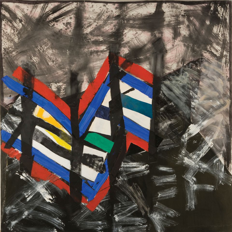
Titled after Dante’s dark wood in The Inferno, Selva Oscura is a work of barely-controlled energy in which the painterly equivalent of a force ten gale gathers in its upper reaches, a potentially destabilising force contained within the boundaries of the canvas. Blow was fully aware of the effects of colour, and of what one might achieve in juxtaposing areas of differentiated hue. Here the loose zigzag formations of coloured strips set amongst the sequence of totemic verticals serve to batten down the hatches. Note how that one patch of sharp green, its intensity heightened by surrounding blacks, is fundamental in both anchoring and lifting the entire composition. Blow also explored colour fully in her prints. There is a lovely suite of four large-scale screenprints made in 1991/2 in which shapes dance in freely-brushed fields of colour, developments of her extemporisations in collage. The artist also translated many of her paintings as prints, rethinking composition and palette in newly-concise statements.
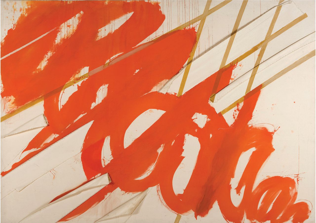
In Blue and White Collage positive and negative shapes interlock in an interdependence that is both monolithic and weightless. The blues here are too dense to be described as celestial, and the aerial quality of the work results instead from the highly nuanced configuration of each form and its spatial interrelationships. The fissure of white travels in a sinuous downwards movement, towards its endpoint in the cropped vertex of the balletically poised triangle. Blow well knew the power of abstraction to subtly evoke both sensation and emotion. Over the course of her long career she worked consistently, exploring and testing the potential of shape, line and colour, in a body of work that continues to enthrall.
|
|
|